It’s rare that you hear overload used in a positive way. With good reason too. Visual overload can destroy your presentation and send potential customers running.
However, there are some specific instances where you can use it to your advantage – as this post will explore.
Why visual overload doesn’t typically work
Visual overload refers to the use of too many visuals or simply too much on show in your presentation.
Why doesn’t it work? It leads to a similar phenomenon, known as cognitive overload, which occurs when there’s too much information for a person to process.

Visual overload makes it hard for your audience to take in everything they can see. This could involve reading all the text on display or processing the numerous images and videos being shown. As a result, they actually absorb less information!
How visual overload impairs engagement and simplicity
Naturally, you want your audience to take in the content of your presentation. This is key to engagement – how they receive and retain what you show and tell them.
Visual overload can make audiences switch off, leading to poor engagement. However, it can also confuse and frustrate even the most engaged audiences. As a result, it complicates your presentation.
In our article on presentation psychology, we discuss how simplicity is crucial to any presentation. In short, people find things simpler when they’re easier. While you might want to pack in as many points as you can, overload can be counterintuitive.
It makes the simple complex, when you want your presentation to make the complex simple! This is a core principle for us at POP, however…
Using visual overload as a tool
All that said, there are some instances where overload – visual and cognitive – can work to your advantage. Namely, when you want to emphasize that there’s too much of something or that it’s overly complex.
For example, you might want to highlight your audience’s pain points. Perhaps their current workflow involves too many steps. Displaying all of these steps at once in your presentation will overload them and underline the complexity – stressing the need for change.
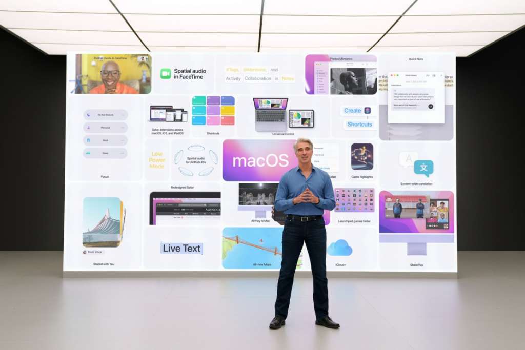
It can also be used to focus on positives too. For instance, you may want to showcase five-star reviews for your company. Presenting numerous reviews simultaneously can overwhelm your audience with the sheer number of satisfied customers. For example, take a look at this slide from Apple’s 2021 Worldwide Developers Conference – there are too many features to take in!
Tread carefully though, as it should only be used for non-essential information. Don’t think you can overload customers with your product’s benefits to emphasize just how many there are, as you’ll also want to explain those during your presentation.
Getting your presentations right every time
Visual overload can be a blessing or a curse, depending on how you use it. But it’s just one of many small details that can make or break a presentation.
If you want to make sure your presentations simplify complex topics, rather than doing the opposite, then get in touch with POP. Our interactive presentation and sales software makes it easy to create personalized, engaging presentations that delight your customers.
To find out more or discuss your project, simply book a demo with our team.
Help your buyers quickly make sense of complex products and information so they can make smarter, faster buying decisions.
Find out how you can use POPcomms interactive presentation software to support your buyers and sellers.
Related Posts

Interactive Sales Tools for Business Development: Personalization to Handoff
Read

Case Study: How POP Creates Interactive Presentations Your Entire Team Can Use
Read

Dynamic Presentation Software: The Future | POPcomms
Read
3 Reasons for Engaging Interactive Presentations | POPcomms
Read